Dropbox: Collaboration between engineers and a designer
Daniel will walk you trough how he became a design engineer and share some design system failures he met during his work at Dropbox.
Daniel Eden is a British Design Engineer, working at Dropbox, with a penchant for the web, interaction design, and typography. He works with the Web Core team at Dropbox where he is fostering better collaboration between the engineering and design teams. Daniel is well know for his sideprojects, like some of our favorites: Just My Type and animate.css
daneden.me
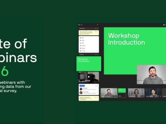
View transcript
Good morning! I've never been to Denmark before, so this is like a double honor to be here. Big thanks to Kasper and the rest of the crew for putting this together. How about a round of applause for those guys? Really great. All the videos and this thing that I learned that they built, like, in the weeks prior, from hand, is kind of crazy. So, hi everyone. My name is Daniel Eden, and I'm a designer. Or at least that's what I called myself six months ago. I currently work at Dropbox. I've been there for like two and a half years, which is a lifetime in tech, as I'm sure many of you know. And when I first joined, for the first two years, I was a product designer on the revenue and growth team. So, working with the revenue team to generate more subscribers, and thank you if you pay for Dropbox. Who uses Dropbox, actually? Yes! Room full of hands. That's great. Who hates Dropbox? There we go. Get out. So, about six months ago, I actually changed my role and my title from designer to design engineer. And design engineer is actually not an official role at Dropbox. It's something that I made up and started calling myself at events like these and around the company. And the reason for that is to kind of better describe the kind of work that I was more interested in. And specifically, that work is fostering better collaboration, be it through tools and workflows, between our design teams and our engineering teams. And what prompted this was a glimpse at our CSS codebase. So, this is a chart of the growth of our CSS codebase between June and September of last year. And during those months, it was growing by an average of 1,000 lines a week every month. So, yeah. Thankfully, the work that I've been doing with my team has had a really meaningful impact on this. We've actually been dropping by about 2,000 lines a week for four weeks in a row now. But not only does this graph show kind of a problem with the way that our engineers were dealing with CSS, they shouldn't have to be writing that much of it. But it also was indicative of a problem between how our design and engineering teams operated. Like, any working design system shouldn't have this rate of growth in the CSS. I also felt poised to be able to address some of these issues because I've always been right in the middle of this spectrum between design and engineering. You like that? Let's see that one more time. And this perspective also landed a different point of view on that question of whether designers should code. Because as somebody who has a background in just kind of building his own products, that was never really a question for me. It was always a case of coding was a means for me to design. And I had a hard time articulating this to my peers and coworkers. And then I saw this quote from Jeff Crowell a few weeks ago. And he said, when I'm coding, I'm still designing. It's just different tools. And some tools are faster than others. And this really well articulated exactly that. It's not really a thing that matters. At the end of the day, you're still producing design work. So let's talk about system failure. That's why I'm here today. And it doesn't look like this. It doesn't... The kind of system failure that I'm most concerned with doesn't strike panic. It's not immediate. It doesn't need immediate action. It's slow. And it's all-consuming. This is fine. It's slow and it's consuming. And it leads to things like feature inconsistency and scope creep across a product. I'm talking about design system failure. And before I go much further, I want to offer kind of a disclosure to you all. And say that I'm not going to stand up here and tell you everything's great at Dropbox. We know what we're doing. The truth is... These are really difficult problems to solve. And Dropbox isn't alone in trying to figure out what the correct approach is. In conversations with many other designers, we found that a lot of the problems that we're facing are throughout the industry. A lot of what I'm going to be talking about today is 100% theoretical. It's stuff that we're just starting to implement. And things that we have yet to see the long-term effects of. It's exciting. It's terrifying. But hopefully, you guys will be able to generate some ideas of your own on how to solve these problems. So, before we can diagnose these kinds of design system failures, what exactly is a design system? I'm currently reading Emil Rüder's typography. And in that, he offers... This definition of design, the practice. The thing that we're all professionals at. Or that we work with other people that do. And he says, To design is to plan, to order, to relate, and to control. In short, it opposes all means of disorder and accident. And I feel like this is a very succinct and appropriate definition of design. But also one that very well defines design systems. A design system is ultimately built to impose order and control. Into a product. To prevent people from designing something that is inconsistent with the rest of the system. And so with this broad definition in mind, what are some abstract examples of design systems that we can look at? One could say that formwork accessories from Herman Miller, designed by Industrial Facilities, is an example of a design system. And how so? Well, because it's a collection of these modules, these office accessories. That can be combined in numerous arrangements. And those arrangements always have a kind of harmony that is imposed by the constraints of the modules. The similarities in width and depth and height. And in a similar way, the 606 Universal Shelving System can be considered a design system. This is designed by Dieter Rahms for WITSO. And again, it follows the similar principles of modularity. And being able to... Being able to arrange these different shelving units in any number of combinations. But always a certain degree of harmony imposed by the constraints of the system. And then, something closer to home as designers for screen and print. We could look to the Graphic Standards Manual. This was designed by Vignale Associates for the New York City Transit Authority. Decades ago now. But it's filled cover to cover with guidelines and instructions on how to produce... And reproduced artwork for the New York City Transit System. Anytime a new line opened and they needed signage for that new station or that new transit line. This is the place that designers would go in order to create artwork that was consistent with the rest of the existing stuff. And all of these systems, all of these examples have common themes that relate back to that definition of imposing control. And order. A successful design system, as these examples show, extinguishes doubt. It enables consistency. Disables misuse. And operates as the source of truth for anybody involved in the product. I want to put some emphasis on that word should. Because in my observations at Dropbox and in conversations with other designers at different companies. These things are really difficult to sustain at scale and on the web. Because at scale, these things increase in difficulty. When your team or your entire company is 20 people, it's not hard to get everybody in a room to agree on a design system. On a proposal for a new kind of pop-up mobile, for instance. But when that company doubles in size and doubles again. Or when that company reaches 1,000 people or 10,000. Or even 100,000. That becomes increasingly difficult. Those individual teams that are now themselves 20 people, 50 people. Come up against the edges of the design system. And need to create something outside of that bounds. And that often goes undocumented or poorly documented. And that can happen dozens of times. Until you have 20 different kinds of buttons across your product. And on the web, these problems arise as well. Because unlike platforms like iOS and Android. There's no higher order of authority. In the case of iOS, we have the human interface guidelines. That can tell us about the minimum size for tap targets. The standard navigation models. In the case of Android, we have material design. Which goes as far as documenting colors and type. And grid usage. But on the web, we have to make all those decisions from scratch ourselves. Of course, there are examples of industry standards. That we can look to for inspiration and for guidance. But we rarely challenge the assumptions that those industry standards make. We rarely question whether those are the correct patterns. That we should be using for our own products. And so on the web and at scale. These design systems that are built to help us as designers. And move faster as an organization. Tend to curb creativity and lack flexibility. By imposing assumed constraints. They make assumptions about screen sizes and device capabilities. And they also lack comprehensive coverage. Because as we all know, as a product and a company grows. There are offshoot projects and experiments. And new features that were just never planned for. This makes us really sad. It makes us bad at our jobs. And the Dropbox design team grew from 15 people to 80 something. In the space of two years. And one thing we failed to do was build an apprehensive and consistent. And comprehensive design system. And so recently we've been putting a lot of thought into the problems that we might face. Further down the road. If we don't act soon. And we anticipated all of the problems that we see today getting worse. And we attributed some of those problems to the very nature of the way that we think of design systems. As an industry or at least as an organization. And one of the things that we learned was that. A lot of these things are related to our output as designers. Because our output a lot of the time looks something like this. It looks like a snapshot of a screen. A snapshot of a component in a certain state. And in order to fully document the behavior and characteristics of a component in a design system. You might end up with dozens or hundreds of screens like this. It's a lot of work for the designers. And a lot of work for the engineers who have to implement that work. It's a very inflexible way of working. And it was this characteristic of inflexibility that really bugged me for the longest time. And I did some research into. Which led me to this clock. Some of you might recognize this. This is the mundane Swiss rail clock. And some of you might even have seen it on your journeys here today. And there's a very interesting thing about this clock. The second hand rotates around the entire clock face in about 58.5 seconds. It's not a full minute. And you might think that's a mistake. But it's entirely purposeful on the engineer's part. You see the engineers building and implementing these clocks in Swiss rail stations. Knew that it would be almost impossible to keep hundreds of clocks in a single station. In sync with each other to the minute. So what they did. Was they built a single master clock. That would keep the official time. When that master clock advanced its minute hand. It would send an electrical pulse to all the other clocks in the station. Allowing their minute hands to advance. Meanwhile. Our second hand runs on a completely independent electric motor. That rotates around the clock in 58.5 seconds. And once it reaches 12 o'clock. It stops. And is only allowed to advance once the minute hand has been advanced. Now 1.5 seconds might not seem like a huge margin for error. But at scale. That's a very effective system for imposing seeming dependence. Interdependence between clocks across a station. And it was this notion of designing a margin for error into a component. That really got me thinking about some. Dopey ideas. About how to design design systems. And the components within them. So going back to our static screenshot of a web page. Or a screen on an app. How do we really document the minutia of a single component. Without documenting every state that it could be in. With hundreds of screens. I went to a presentation from Naoto Fukasawa. A few months ago. And he's an industrial designer at Muji. He had this one thing to say that really stuck with me. He said. Start thinking from subtraction. Not addition. And this idea really came in handy when thinking about how we approach design systems. And rather than creating dozens or hundreds more of these screenshots. We actually take away everything that isn't documenting the component itself. Now this isn't a new notion. This is something that people have been talking about for a long time. This is called atomic design. You break a system down into its core components. Buttons, inputs, forms. Those kinds of things. But you still brush up against a lot of the problems that we diagnosed in design systems. So what do you do? You keep taking away. You keep subtracting. You consider the things about this component. This single isolated piece that might be mutated over the course of a product's life cycle. Maybe this input or whatever component it is will change in background color. You can't attribute that as a fixed immutable property of the component. So you throw it out. Maybe you can even change its size and its content. Maybe you can't be sure about the size. So you throw those out as constraints. And what you're left with are the very basic immutable properties of that component. And we consider those themselves as components. Instead of thinking about a button or an input or a logo, you think about the visual and behavioral characteristics of that thing. And make those components that you later recreate. I'm starting to call this subatomic design. And it freezes from the constraints of existing design systems by being incredibly unassuming about the purpose for which a component is going to be used. It's based on a design system that's been around for a really long time. It's called the periodic table of elements. And the idea here is that you have this extremely comprehensive list of recipes. Extremely comprehensive list of ingredients that can be combined in almost innumerable ways to create new building materials. This is something we're all innately familiar with. This is something we learned in class in school. This is something that we should be taking advantage of. So we take the elements that comprise a button on a webpage or in an app. And we break it down to its subatomic components. Things like a border and padding and cursor. Hover behavior. Those are all individual components themselves which can be recomposed into anything they want to be. And then we're freed from the assumption that this button is always going to appear this way. Because in order to change it, you just change it. You just mutate one of those properties. It's not a separate component. You're just recombining a different component. And then these new elements can be built up. Until we have something that resembles our original output. Now, this might seem like a long-winded way to arrive back at this same place. But the idea here wasn't necessarily to change the output of a designer's work. So much as it was to change the way that they reason about the components that they're trying to document and work with. And instead of documenting the discrete components on their own. By documenting and constraining the properties that comprise that component. We can actually impose a surprising amount of flexibility in the way that we design things. This is a lot of abstract thought, I know. But this already kind of exists. On the engineering side, we have tools like React. It's a JavaScript framework and library from Facebook to build UI components. And this notion of breaking things down into the smallest possible pieces isn't a new notion at all. It's called... The name eludes me now. The single responsibility. And you give each component a single responsibility. And it's designed to do that one thing well. And you completely encapsulate that behavior. And we have this in CSS as well. There are frameworks such as tachyons. Where you are given a suite of these very tiny classes that do a single thing. In this case, directional borders. And you recompose those classes to create more complex elements. But on the side of the product designer, the tools that they use from day to day are still fairly limited. Granted, things are changing. We now have symbols in Sketch that allow us to change or mutate properties of an element. Things like photos and text labels. But we're still limited to making assumptions about the widths and heights of these things. We can't set constraints based on its surroundings. We can't break this component down into smaller pieces and recompose them at will. And then there are tools like Origami Studio. Which was just recently announced from Facebook. Where again, we get very similar controls over mutating things like labels in text fields and photos. But still no real essence of being able to break a component down into smaller pieces. And reuse those as components themselves. Alex Schleifer, the design director at Airbnb, recently talked about how Airbnb changed their entire design process. And rebuilt a design system of their own. It's a really amazing post. And in that he says, you can't innovate on products without first innovating the way that you build them. And I believe this is never held more true. Especially as we enter a more recent way of working between design and engineering. With things like prototyping. In tools such as Framer and in Quartz Composer. And even native prototyping in Xcode and Swift. But the design tools that people use to work more quickly are still shackled by these assumptions about the way that people want to work. We still have to make assumptions and bargain with ourselves about the width of a screen that we're designing for. Or the behavior and device capabilities of the device. That we're eventually going to ship this thing on. As I've mentioned at the start of this talk. Pretty much all of this stuff is based purely on theory. I don't make any assumptions about the success or failure of these notions. They're just dopey ideas. But hopefully we're doing our part in contributing to a much larger conversation about how design tools should work. What they can do to help us as designers. And help encourage much closer collaboration between design teams and engineering teams. So that we can build the best products that we can. Thank you so much.


