Peter Gregersen on disrupting banking -the design of MobilePay
Peter will take you behind the scenes of MobilePay and give you insights into how the app was designed and constantly evolves. He is business developer and UX at MobilePay, and was part of the initial team behind MobilePay.
View transcript
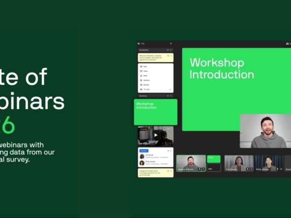
Wow, that was interesting. So, our next speaker is from a Danish company that everybody in Denmark knows. In my opinion, MobilePay is the first real game changer in digital design in Denmark. I'm not meaning to insult anybody, it's just that, like I just said, everybody knows and uses MobilePay here. It has completely changed the way we bank, the way with whom and how we exchange money, and how we complete a purchase. I used to have a hard time explaining what I do, and now all I have to say is, oh, you know MobilePay? Not that I'm taking the honors of designing it, but it's just such an easy way to explain how you can make easy and intuitive apps or UX design in general. So, Peter is, he tells me, he's a lead business developer, sorry, on the award-winning Mobile Denske Bank and also on MobilePay. He's been with Denske Bank, the Danish bank, since 2007 and has been responsible for the interaction design and UX in MobilePay. Even though I keep saying how wonderful the UX is in MobilePay, Peter says he would actually have preferred to have designed Minecraft because it would have given him more points with his boys. Please welcome Peter Gregersen of MobilePay. It's switched on now. Yeah, and do I have my notes here as well? Yeah, I think they are. Okay, fine. And thank you for giving me this opportunity and thank you for the headline of this, of the speak. It's not my own invention because when we did MobilePay, we didn't speak of disrupting the network. We didn't speak of disruptive, innovative or something like that. I think the notion of disruption came a bit after we released our app. My name is Peter and I work as a senior user experience specialist. That's kind of a new title in the bank. Still, we are a very traditional bank, so just this having someone working with user experience is quite new for us. Yeah, almost the last 10 years. Actually, I did start in Danske in 2005 or even in 2001. And my first task in regards to mobile development was our mobile bank back in 2007. And do you recall what a mobile phone looked like back then? It was just in the time of the new iPhone or the first iPhone. So we did a mobile bank back then. We called it internally the text TV version of the e-banking. And yeah, the first design initiative we took on that was just to put some blue rectangular forms around the headers. So yeah, that was the first mobile design we did. Afterwards, I worked on the mobile bank, the one with the wheel, as you might know, and then MobilePay. So let's get started. Is this better? Okay. Much better. Much better, thank you. And by the way, should we do a quick survey here? How many of you don't have MobilePay on your smartphone? Okay, quite a few. Okay. It's just for me to, yeah, I'll give a quick introduction then. Well, this presentation will take you behind the scenes of MobilePay and the MobilePay design process. So my ambition is that you will learn what we did to get this market position that we're in now and how we gained our reach. And what we do right now just to enforce the product to keep on our users. And hopefully, I'll also give you some key learnings that you can use in your own design processes. So first of all, like I said, we didn't have disruption in the mind when we did MobilePay. But looking back, it could be a disruptive ambition even though it wasn't stated that way. So let's start with some MobilePay facts. We have 2.6 million users now in Denmark. We have a 50% share of all the smartphones in Denmark. And 70% of our users are not customers within our bank. And I think that's the disruptive part, the first disruptive part of MobilePay as a product. Because as a traditional bank, we normally only make products for our own customers. So this is kind of a new approach. And when we speak about disruption, let's take a look on this figure. The figure to the right, online banking, it went quite well. It was exciting to be part of that development. We gained users. When we did the mobile bank, it was quite different. People had smartphones in their pocket and they also want to be a part of the mobile bank's success. So yeah, this was also quite a good success. But with MobilePay, when we launched that, we went from zero users to 2.6 million users in just 24 months. So that was impressive. And that's really a disruptive factor, I think. When I do these talks about MobilePay, I always state that MobilePay is not a traditional banking product. So how do we differ from a traditional banking product? Well, you see, first of all, we are for all users. We're not only catering our own customers. MobilePay is not a... We do not have traditional banking. Do you know when a traditional banking product peaks? Yeah, in the end months when people receive their salary. We also peak at these times, but the actual peak of MobilePay is every Friday night. So when people go out, they need to use MobilePay in order to pay their friends. So this is the status of MobilePay right now. So let's take a look at how we achieved to get 2.6 million users to download our app and register as users. So actually, it's quite precise. Three years ago, I started working on MobilePay. We were just two people from the start. And we got a pile of slideshows, strategic slideshows from our top management. And we were just giving the opportunity to work on something. Which implied that we should reach a lot of customers. So you can ask yourself, did we have a business case to start with? Well, not really. But looking back, you can say this was kind of the business case. So in these strategic slides, there was a lot about mobile payment is a new thing. And we should put a lot of effort in getting a lot of users. And of course, we are a bank, so we also want to earn money on it. In the project, we did a lot of things in order to push the getting rich ambition a bit away. Because getting a lot of users using a new product, it's kind of hard. Especially if you have to communicate that you want to earn money. Three years ago, Danske Bank was in quite a hard situation. We had a really bad reputation. And if you're a Dane, you might know what I'm talking about. So at this time, it was just very hard to come out with a new product and saying that, okay, we want to earn money on it. So mobile pay from the start was more like a two-sided business model. We knew that we want to give something for free for the end users. But on the other hand, we knew that we also had to earn money on it in some way. So it's, yeah, like I said, it's a two-sided business model, free for the users. And we are charging business customers. And it's just like, yeah, the Google concept or whatever. So let's see how we constructed this product. Just with the ambition to get rich as quickly as possible. So the design ambition, you can say, was we had to come up with a product that was easy to use. And would be just as easy as cash. So this is basically the painkiller. We knew that Danes used a lot of cash to pay friends and pay for certain things. And we wanted to relieve that painkiller, that pain. Because, yeah, cash, they're not sexy. They're quite hard to use. You have to go to an ATM and withdraw them. You have to keep them in the pocket and so on. So we sat down and came up with this kind of solution based on our own infrastructure. So we could ask customers to enter a card number in a digital solution. We would then use our internal payment infrastructure. Yes, we are a bank. So we are quite familiar with that. So we could use that to credit a customer's account. And actually we were able to do this not only for our own customers but for all users in Denmark. By having this infrastructure. So from a banking perspective, this was quite an easy decision. Although we had to really argue for our business that, okay, this is the right solution. Because in this sense we can make the perfect setup without any hastes for our users. So this is more like the technical concept. What the user should feel like is this experience. That's the hard part. So we got help from different external parties. And we sat down and we designed the product just from the start. So the crucial part here is that although we have this infrastructure behind, customers shouldn't notice. They shouldn't bother. What they should experience is money goes from A to B without any hastes. And you know, banks, they often, yeah, they want to keep money in weekends. And they don't want to send money to customers' account before they have the money on their own account. And all that we were able to bypass just by stating that this is the real customer experience. So basically we had to take a lot of decisions. Luckily we got a full commitment from top management. We had a good budget. And we were able just to move ahead without consulting any internal stakeholders. So basically the two-man project soon grew to a little army. And we were just with that one focus to build the best app possible. And once again, I don't see this as a banking product. I see this as an IT product. So we could have been a startup company sitting in a basement. And we actually joked about that. Why shouldn't we just do this ourselves? And from an IT perspective, we managed to come from a very, very small company. We managed to come from the idea to the end product in just six months. Yeah, I can tell you that in Dansk Bank that's quite an achievement. Because normally projects just last forever. So let's just take a look on what we came up with. So basically the design idea behind the app is that it should be very easy to use. So the first picture when you have made the registration is just this. It's a calculator-based input field. So once again, this screen has just one purpose. You should enter the amount that you want to transfer. So you can say the user will know this kind of design from a calculator. So just typing in the amount and you're off to go. On the other hand, we also want to make something that looks smart. And we had good experience in that. Some of you might know our mobile bank with the wheel. So we added this kind of playfulness in the design as well. By that I mean we have the slider and the button and we have this receipt coming out of the screen. And for us, that has been kind of a trademark of how a mobile payment should look like. And we honor this concept of how the payment should behave. And I know a lot of users do as well. So as a user, you should feel comfortable whenever you slide the Zenpinge slider. You know that you get a printed receipt and you have paid. Going back to a more corporate perspective, our development principles when we do mobile payment development. So we put a lot of focus in having an agile setup in the IT department. So we have short development cycles and we have a backlog and so on. Some of you might find this quite familiar. Actually, we are quite inspired by the way Spotify do their development. So I'm quite excited. We also have a lot of benefit with collaboration with the external suppliers. So our app is developed by TriFog. We had Intermedia on the first concept and design part of the app. And of course, we also have a lot of user involvement. But with the user involvement, we didn't do any tests before launching. Actually, what we did was just ensuring the design by having a lot of internal users using mobile pay before launching. And making sure that the design was looked upon by many stakeholders. And after releasing, it went quite good. So we got a lot of input from our users. And we were able to just make small tweaks in order just to make this product as good as possible. Okay. So we now have the mobile pay. We are quite successful. We have gained a lot of reach. That was our first ambition. But today, we are in a totally different place. Now you can say we have a quite mature product. We are almost a market standard for payments, at least in Denmark. So we are in a totally different place. We are not a small project team anymore. We are nearly 100 people working on just the IT part of mobile pay. So it's not just a small apartment in the basement anymore. So this means that it's a totally new way of thinking the product. We cannot just move as quickly as before. We also have a lot of development on the getting rich part. So actually, no surprise, the bank wants to earn money on this product as well. The point is here, it's still free for personal use. But we want to monetize on the product. So let's take a look on the design. So you can ask yourself, do we have a design pattern for mobile pay? Well, not really, but this one is one of my favorites when I have to explain what mobile pay should be like. So we have a lot of people working on mobile pay, but what we should remember is that mobile pay should be like a kid's book. It should be simple. It should be easygoing. You should feel comfortable. You should be able to navigate and interact with people. You should interact with the app while in a busy situation, standing in the queue line. And you should be able to read the screens under noisy conditions. And I think that's quite important to remember when making new designs, when making new flows, when making new functions. Always remember that mobile pay is a product for making payments and nothing else. So when we are releasing new functions, we must remember that the reason why users love us is that it's easy to use. They do their payment and they're off to go. They can enjoy their coffee or enjoy the pizza they just bought with their friends. So do you have an idea of how long time our average session is? How long time will a user use a mobile pay? No. Actually less than 40 seconds. It's more around 20 seconds. So a user will grab his phone in the pocket, enter mobile pay, do his payment, and then off to go. So yeah, that is also like the metaphor with the kid books. It's quite easy ready and you can put it away and then go on to your next task. So let's move away from this maybe funny design pattern and turn our eyes to something more... Something more specific with the design. So I brought this example. This is how a mobile pay looked like in some early stage. We had this ambition of making something with the geolocation feature on smartphones. It was kind of an experimental approach. Okay, we have smartphones out there. They use geolocation. Could we use that for something? So we decided to use it for easy access to our businesses out there. So the local bar could have his position on the personal app. And I think that was quite a good approach. It would be quite easy for personal users just to tap. The business and the screen and then move on to his payment. Like I said, we don't do much user test before launching things. At least not these small things. So I thought this would end up quite good. But it didn't. So what happened here is just an example of the fight of attention we are in. People are in noisy situations. They don't read our screens. So what happened was they were used to that, okay, my friend is always in the top of this list. And I want to transfer to my friend. I just tap the top item in the list. And suddenly we introduced this new element with real shops nearby. So what happened was there was a hair cutter in Midtown Copenhagen that received a lot of failed payments. Because people had their attention, although other places than in mobile paying just tapped the nearest shop. So he received a lot of money and he called us and said, no, I don't want to be part of this because I'm receiving too much money. That's not mine. So we had to come up with something new. And that's what I tried to notion as an evolutionary design. So luckily we had this agile approach. So we are able to make new functions quite quickly and launch them quite quickly as well. So we came up with a new solution. Yeah, we just wrapped the businesses behind this drop-down menu. It might not be the best solution, but at least it worked. Our businesses were hidden and they didn't receive a false transfer anymore. And like I said, mobile pay today is quite another place or is somewhere else than we were when we launched. We launched as a clear or solely P2P solution. So the transfer between persons is very easy. But now we should also cater shops, points of sales and so on. So it's a totally new design situation. So I just brought this one. This could be how mobile pay could look like in the future as we also need to empathize that mobile pay could also be used in your local supermarket and so on. So we are always evolving. We are moving away from just being a P2P app and becoming something else. So here's just some examples of these functions we now have in mobile pay. We have the app switch function where you can switch between different apps and make payments easy. We have online shopping. We have point of sale, as you might know, from your supermarket. We have a receive function where you can receive your payment. We have receive digitally. We have just launched a bonus function where you get bonus whenever you pay with mobile pay. You can make NGO donations and so on. So what you see here is that we try to build an ecosystem around mobile pay. So we shouldn't just offering P2P payments but a lot of other payments. So that's just a way to spread the scope. And simply make an ecosystem. Just like Apple make their ecosystems with different vendors or inviting different vendors and third parties on board and the customers. And like with other ecosystems, every party gets their share of benefit of the solution. So, what are we working on right now? Well, basically it's all about getting rich and getting rich still. So I think getting rich, we are quite satisfied with the reach in Denmark. We are still onboarding new customers. We have launched apps in Finland and Norway. We are not quite as successful there. So we are still aiming for getting even more rich in these countries. And we still want to maintain our reach in Denmark. We are facing a kind of heavily competition in Denmark. So what are we exactly doing in order to keep our customers to create the stickiness that we want? And that is still putting a lot of effort in making transfers between persons easily. Because that's where the traffic is right now. A lot of the use of mobile pay is still transfers between persons. And how can you keep your customers using mobile pay for that? So examples are that we try to be more social. Use social concepts. You know, Facebook launched payment solutions as well. So mobile pay as an ATV payment app will also launch social functions. And that could be starting a chat about your payment. That could be uploading images and so on. So a lot of supporting functions around the single payment. And like I said, we are also working on the getting rich part. We are not there yet. So for you, mobile pay is still like a free person. You don't have to pay anything. But what we are aiming for is that the use of mobile pay will eventually not making us rich. It's not popular to say that when you are a bank. But eventually it makes us rich. And eventually it makes some cash flow and makes us earn money on the product. And by that, I mean we are making a lot of partnerships. We can utilize the huge user numbers we have in Denmark by making partnerships. We have a lot of companies want to be a part of this success and join our ecosystems. So moving on to some key learnings from our work with mobile pay would be that you should always keep focus on eliminating customer pains. We started with our customer pain that cash are quite hard to use. It's not very sexy to use cash. And we eliminated that pain in Denmark by introducing an easy P2P solution. So I think that's a good starting point. What is your customer pain and what can you do to ease that? Then we also have quite a good success with making design simple and playful. For me coming from a traditional IT department, it can still be quite a hassle to convince all the stakeholders that, okay, we need to invest in good design. We need to invest in tweaking the functions. So it takes time to make good design and it takes a lot of hard work. But here we can say that design matters. I don't think that mobile pay would be there where we are today if we hadn't had the time and the budget to invest in the design. And then, of course, you need to beware of other disruptors. So by that I mean you really need to stick to what you're good at. We need to remember that we are a payment app that launches a solution for easy payments between persons. We then build an ecosystem around these functions, but we still need to be good at making P2P payments. We also need to be good at many other things, but it's quite important not to lose your focus. And just trying to be average in many areas because then some other company will just make a new app and that will be the new painkiller for easy payments. And I think these are some key learnings that you can take away from here. So anyone has any questions? We have about five minutes before coffee and cake. Yeah. And I think we should get started. Okay. So we'll get some tricks from mobile pay. Just one question. My name is Marina. I come from Responsive. And I guess you were probably waiting to hear this. Swip just launched their payment mobile app or whatever you want to call it. So what's your strategy against that? Well, like I said before, we are in a quite good position. And I think we still have the market reach even though they are above us in the app store. I think they have tried different approaches on getting in on us. So our ambition is just still to cater our customers, to make great solutions, to create stickiness around our solutions. And we seem to just to, yeah, you can say, develop them as fast as we can in order to keep them behind us. And I mean now almost every other bank than you are behind the Swip. Do you think that's going to be a challenge? No. Actually, I think that you can call it an advantage for us at least. If you think of mobile pay as a disruptive initiative, well, all the other banks are being disrupted by mobile pay because we also cater them. We also cater their customers. So when you are a customer in Nordea and Jyske Bank, you have mobile pay in your pocket and you're using mobile pay. So our ambition is to, yeah, simply to just deliver even more products that can take away business from other banks because mobile pay will be the preferred payment channel for most users. Thank you. Thank you, Marina. And we have one other one over here on this side. Thank you. Yeah, I'm just wondering if mobile pay has been successful or if you've tracked like number of, I don't know, new accounts, new like normal bank accounts created as a result of mobile pay. Like has it stolen customers from Nordea? Yeah, actually, we've been quite cautious about that because we don't want to make the other banks really mad at us. So I know that they kind of mad at us now. But my top manager, he's a judo fighter and he once told that we shouldn't put other banks in the corner because that's when they get really difficult to fight against. So, yeah, you can say we want to disrupt the banking industry and I think this is just the first step and we simply just haven't come to that yet. But I know we are gaining customers. And what you don't know is that Danske Bank is in a really bad position when it comes to image. So mobile pay is kind of an initiative that raise our level of image. So slowly people are getting a better perception of Danske Bank and, yeah, hopefully they will become real banking customers with us. But, I mean, looking at the banking industry, where will it be in 10 years? Are we having real banks then or will you just have your paycheck from Apple? We don't know. Thanks. And I'll tell you about that story with the bad image. It's good. Anyone else? Yes, we have two people. Let's start in the back row. The turquoise shirt. Hi, I'm Vladimir from Trustpilot. You mentioned that you don't do user tests prior to releasing and user tests. Yeah. I'm wondering, so you've done internal tests. So I'm wondering as to why and is it something that you've tried before and it hasn't worked for you or like what's the reason as to why you don't do it? It might be a bit provocative but I tend to say that mobile pay isn't made by users but for users. So actually when it all comes down, I think being in an agile development process, we had to launch in just six months from nothing to full product. We simply didn't have the time. We didn't have the time for making a full scale user test. But I know we are testing new stuff and we are doing it. But I think these smartphones, it just gives you a way to release quickly and release fast. So sometimes it's not required to make a full scale user test because you can make iterations quite quickly. And you know there's a law called Boyd's law of iteration. It says speed of iteration beats quality of iteration. So you can stick to that and just say, okay, we might not have the best quality but at least we can speed up the iteration and just release something in next month being a bit better. Yeah. And on the road, yes, I think you're the last question. Okay. Go ahead. I'm from work. Your last slide was about keeping focus and having design, make simple design. And then you also talked about trying to take some part of the Facebook with sharing or the social aspect. How does that connect with keeping simple and focus on your primary function? Yeah. That's the real design challenge. Luckily we have great designers on our team. But I don't think it's that far. Well, as a user, you're used to whenever you're doing something on your smartphone, you will be able to share it on Instagram and so on. So actually people do that already. We had a large NGO donation here in Denmark last week. And what we saw was that because we implemented some social features in mobile pay, suddenly without any involvement from the company, we had a lot of people who were doing it. And I think it's important that we make sure that people start making funny donations and posting them on Twitter. So that's the main driver for having people still using mobile pay that they can do these kind of things. And, of course, we should keep it simple and keep the motorway of payment just straight and straightforward. Peter, most of our crowd is Danish. They need coffee now. Yeah. Thank you, Peter. Please give him a hand. Could I? Check. I also happen to know that the cake they make here


